Setting Up Your Background Grid in InDesign
If you read my blog post about the essential steps I take in designing a book, then you’re ready to know where I go from there. The first thing I do is set up my background grid. Your background grid will give your publication continuity and uniformity. If you set it up correctly, your leading (the spacing between two lines of text) will be at the correct distance and your reader will thank you for that. So how do we do this? Let’s get started.
YOUR FONT
Depending on what font you choose for your body copy, you will then need to select a size for that font that is appropriate for the user. You may want to do a few test prints to get a feel for the size you’re selecting and to also see what the user will be reading. Remember, font size looks a lot different on your screen than it does in print.
So, why is this important? Because no two fonts at the same point size look the same. They might be very similar, but for example, Baskerville at 10 pts versus Century Schoolbook at 10 pts is a tad bit smaller.
Once you settle on the correct size, you’ll then want to settle on the leading (remember, it’s the space between two lines of text). This is important because if you don’t do this correctly, your spacing between each line might be a little tight, making it harder to read. Or just the opposite might happen, your text will skip a line between lines and then you have too much space.
Here is Baskerville text set at 10.5 pts on a 12 pt grid. Because the size of the text is too big for that size of grid, InDesign will tell it to skip a line between each one to give it more breathing room.
Here is the same size text on a 14 pt grid. See the difference? InDesign now knows that there’s more breathing room in the leading and will, therefore, move the text along to the next line, not skipping.
YOUR BACKGROUND GRID
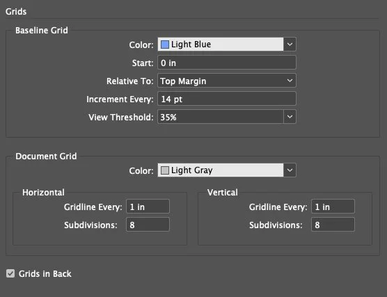
Next, you’ll want your baseline grid to line up nicely with your margins and you’ll want to do this in Parent Pages. Why? So that it will carry over to each page that you apply a Parent Page to it. Once you’ve set up your margins to your liking (in InDesign, go to Layout > Margins and Columns to set this up), you’re ready to finalize the baseline grid. You’ll want to “Start” at zero and have it relative to the top margin as shown in the image below.
To get this menu, in InDesign, click on “InDesign” at the top left-hand corner of your screen, scroll down to “Preferences” and then select “Grids”.
YOUR COLUMNS
Unless you’re working with a novel that is mainly text and not much else, you’ll want to work with columns to help give your publication structure. You don’t want to place images or pull quotes or other text just nilly willy onto your page. Your publication will need structure and it will need to provide a positive reading experience for the user.
To set up your columns, you’re going to go back to Layout > Margins and Columns. Your gutter (the space between two columns) should be the same size as your background grid. On the above image where my text is laid out correctly, my background grid is set at 14 pt. I’ll want my gutter size to be the same.
Type in 14 pt where it says “Gutter”. Don’t worry. InDesign will convert it to the right size. If you’re working in inches, it will convert it to inches. If you’re working in millimeters, it will convert it to millimeters and so on. As for the column numbers, it’s really up to you how many you want, but I suggest at least seven and up to ten columns on each page. This will give you a lot more flexibility when placing images or pull quotes.
Here are a few examples of what your page layout could look like when laying out text and images using columns. Everything is laid out with a solid structural foundation and the user will have a pleasant reading experience.
And this is how I complete setting up my background grids and columns on my pages. It’s not at all complicated and it’s a crucial piece to correctly laying out publications.


