The Correct Use of Typography in Design Projects
(And How I Like Seeing Them Used- Part 1)
One of my favorite things about graphic design is typography. Every logo, web page, editorial design, or packaging design is made up of a lot of moving parts, but the one thing that anchors them all down and either makes or breaks the design is the typography. Typography is the art and technique of arranging type and it consists of type (the name of the type, such as Arial) and fonts (breaking down Arial even further such as Arial Regular, Arial Bold, Arial Italic, etc). You could have the most amazing icon or name for your logo but if you pair it with the incorrect type, it’s going to fall flat. You could have the most amazing product in a box but if you pick the wrong type to go on it, you might miss your sales goals because the message, through type, looks “meh”. In this blog post, I want to share with you how using the right type for your project is important. If you’re a seasoned graphic designer, this post is not for you as you obviously know what I’m talking about. But if you’re just starting out, here are some pointers to guide you in the right direction.
TYPE STYLES THAT STAND THE TEST OF TIME
There are a lot of cool types out there and I love them as much as the next person, but when selecting the right type for your project, you want something that is going to be timeless regardless of what’s in style now. If you go with something trendy for, say a word mark logo or maybe some text on a packaging design, you might be doing a re-brand a few years down the road and that is not something your client is going to be too thrilled about. Rebranding because the current brand isn’t “catchy” anymore means more money spent and could be sending the wrong message to their audience. It might relay that they’re not consistent in who they are as a company and therefore, it might not generate a lot of trust. Would you trust a product that is always changing and is not consistent? It would make me wonder who’s in charge behind the brand.
A few examples of what I consider trendy types (all taken from Pinterest). They look great and fun and work well with the brands shown, but again, I feel they are trendy. It’s hard to tell if the type selected will still work in 10 plus years. Maybe. Maybe not.
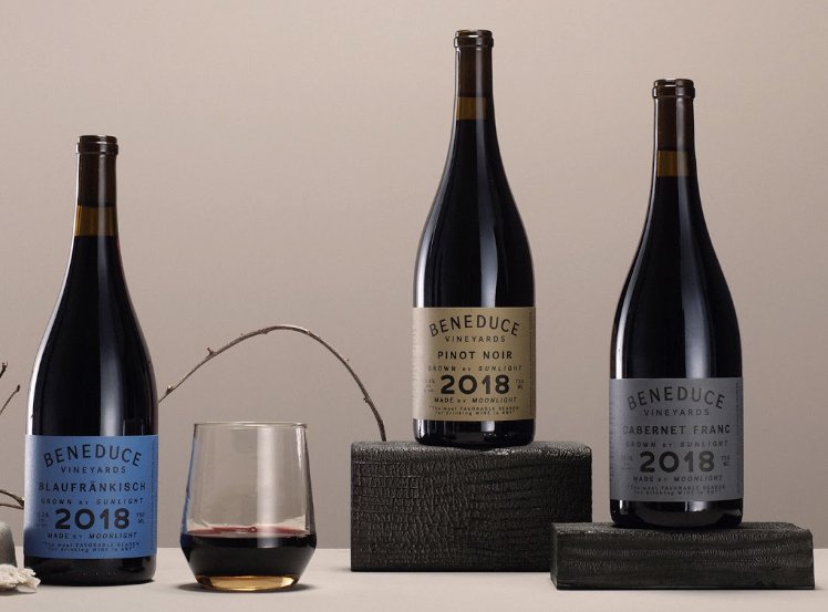
Sometimes selecting the right product is based purely on emotion and sometimes, the way something looks has a lot to do with being selected. I think that the type selection has a lot to do with how the final label or product looks. How is that label designed? Does it have a fun or classy look to it? I do this with wine. I’m not a big wine drinker and therefore, I couldn’t tell you the difference between a good wine or a cheap wine (other than the price, obviously) and sometimes I will decide on which bottle to buy based solely on what the label looks like. Pretty scary, huh? Pure emotion.
THE DIFFERENCE BETWEEN TRENDY AND CLASSIC (IN MY OPINION)
For me, trendy types are those new, fun to look at types with either their curvy lines or bold, outstanding letterforms. I see them used in templates in places like Canva or showcased on Pinterest, and I feel like these draws in the younger crowd whether it be on the consumer side or the designer side. The younger crowd is probably looking for something new, shiny, hip and perhaps these are the types of letterforms that appeal most to them, but I would proceed with caution.
Trendy isn’t bad. But it’s just that. A trend. One that comes and then goes almost as quickly as it arrived and though I’m not against using them in your design, I would consider the use long-term. Things evolve very quickly now and you want to make sure the type you’ve selected for that logo, packaging, or signage is going to stand up against the ever-changing canvas of our times.
The classic designs are those that look amazing regardless of time. These are, what I like to call, the “safer” types, classic looking serifs like Baskerville or Georgia, Times New Roman; or perhaps classic looking sans serifs like Montserrat or Open Sans. They sound boring but the key is to know how to use them in a way that works with the design.
Here are some examples of classy types that I believe are elegantly understated. They are simple yet very sophisticated when used properly. First image is by VistaPrint; second image by Garage Design Studio; third image by Biterswit on Etsy.
USING CLASSIC TYPES IN YOUR DESIGN
The classic types, if used correctly, can have an understated beauty to them. They speak for themselves. They elevate the brand or project to something that is sophisticated and timeless. Their main job is to sell whatever it is you’re trying to sell or communicate. They don’t distract from the product, they enhance it.
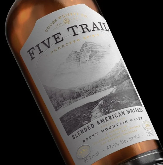
One of my many go-to examples of classic type use are those wine labels that I mentioned. There are a lot of designs out there from upscale sophisticated to quirky fun. But in my opinion, the ones that are the most timeless are ones where the typography is the protagonist, and they are used in an intelligent way. I’m also a big fan of Mexican spirits labels with amazing typographical layouts, whether it be tequila, mezcal, or any other concoction. The type selection for these brands must be timeless and sophisticated if they want to keep their reputation for being one of the best.
Just a few of some elegant spirits labels that have simple but sophisticated typography. First image by Stranger and Stranger; second image by Chad Michael Studios; third image by Abraham Lule
WHY TYPE SELECTION IS IMPORTANT IN EDITORIAL DESIGNS
They say print is dead, but I beg to differ. I am thrilled that I am still able to pick up some of my favorite magazines at my local retailers and hold a hard copy of print in my hands. For me, nothing is more satisfying than flipping the pages of my beloved magazines and looking at images, reading the print. Selecting the right type in these designs is crucial because you must keep the reader in mind. They must be able to read the print to enjoy it fully. Those modern, trendy types will be better placed in titles, not in body text. I would even be careful to used them in pull quotes as they might be difficult to read if there’s more than one to two lines of text happening. Some of these types are what I think of as “display” types. What do I mean for display? They’re a little bit “chunkier” or bigger, if you will, and they are to be used sparingly. Because of the way they are designed, they aren’t meant to be read as body text (several long lines of text).
There are certain rules about styles and sizes. For print, you normally want to go with a serif type because they’re easier on the eyes to be able to distinguish all the different letter forms (this isn’t a “set in stone” rule, but one that is recommended). And if you’re reading a paragraph of text, you probably want to go anywhere between 10-12 pts (it all depends on the type you select). Selecting the right type for novels or text heavy books is important because you want the reader’s eye to be comfortable.
WHY TYPE SELECTION IS IMPORTANT IN WEB DESIGNS
Selecting the correct type for web is really a whole blog post in and of itself. There’s a reason why when you buy types, you must select if it’s for desktop or web. They look the same (sort of) but how they work out in screen versus print is different. If this topic interests you, I suggest reading this article on it.
The rules for the size of type for web is different. Again, it all depends on the type you select but you normally want to start with 14 pts for size. And here, I like to select a sans serif type for body text and serif types for my titles and subtitles (the opposite of how I work for print). Squarespace has a lot of built in types that you can choose from and their selection is quite nice. Stay tuned for an upcoming blog post on how to use type in Squarespace.
WHY TYPE SELECTION IS IMPORTANT IN PACKAGING DESIGNS
I am not an expert in packaging design, but I do love me a good layout. I worked very briefly on some packaging design for a few food products and learned that the FDA has some pretty strict rules about typography styles and sizes, especially when it comes to the ingredient list and nutritional values. But in packaging design, you want your product to tell a story about what you’re selling and using the right type is crucial. Say you’re selling a beauty product. Besides the obvious visual elements this will have, you probably don’t want any script or handwritten type on your label or package. That just wouldn’t make sense AND it would be very hard to read. You might use it minimally as support text (and I’m talking a word or two, not a whole line of text). But for the name, you’ll want a type that is strong and tells your customer what it is. Never underestimate the simplicity yet elegance of a simple typographical layout in packaging.
Just a few examples of how typography, when used sensibly, is quite sophisticated and elegant in packaging design for beauty products.
I hope this post has helped you understand the importance of type selection and why typography plays such a crucial role in design projects. In my next post, I’ll be sharing my favorite go-to types on various projects and sharing some projects I’ve seen where I think the typography selection is top-notch. Stay tuned!


