Discover the Art of Landscape Architecture Book Design
SERVICES: EDITORIAL DESIGN + ART DIRECTION
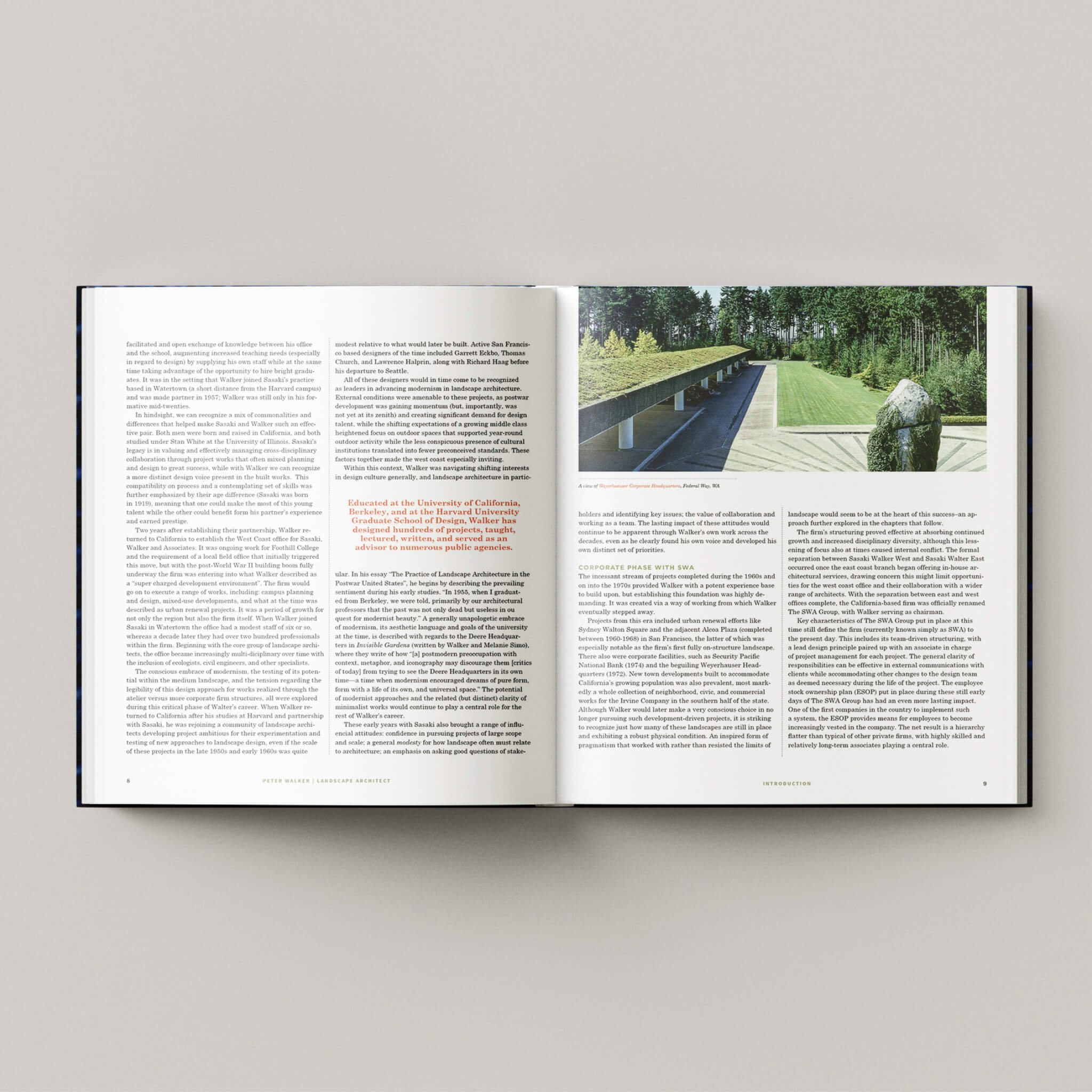
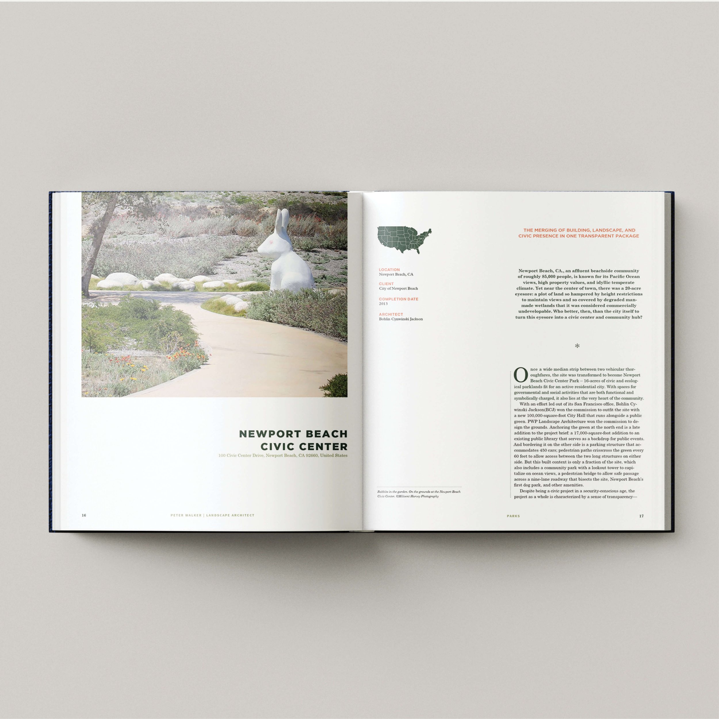
This fictious landscape book was designed for a course in editorial design and it showcases the various image layouts, chapter openers, section openers and pull quotes that are possible in a book design.
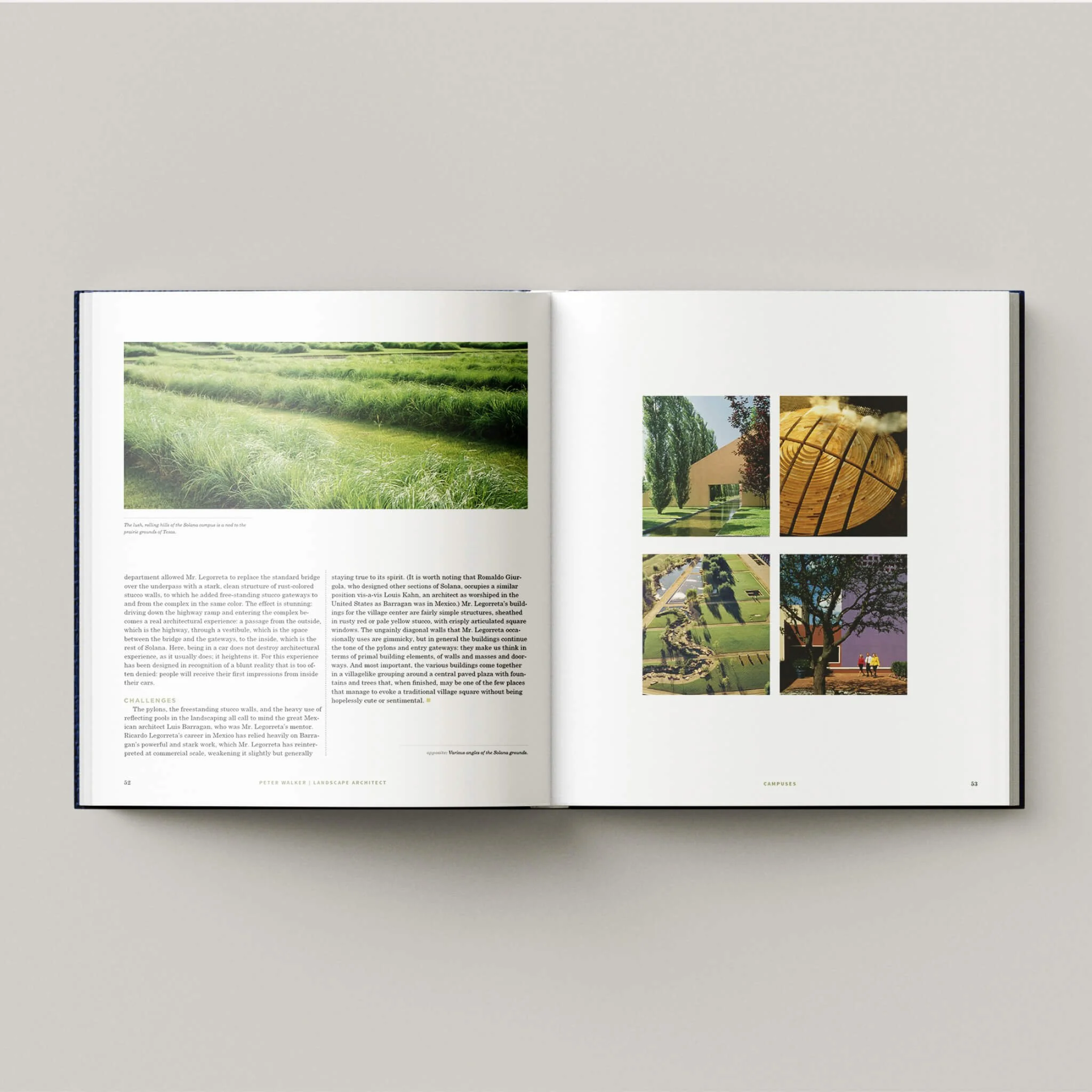
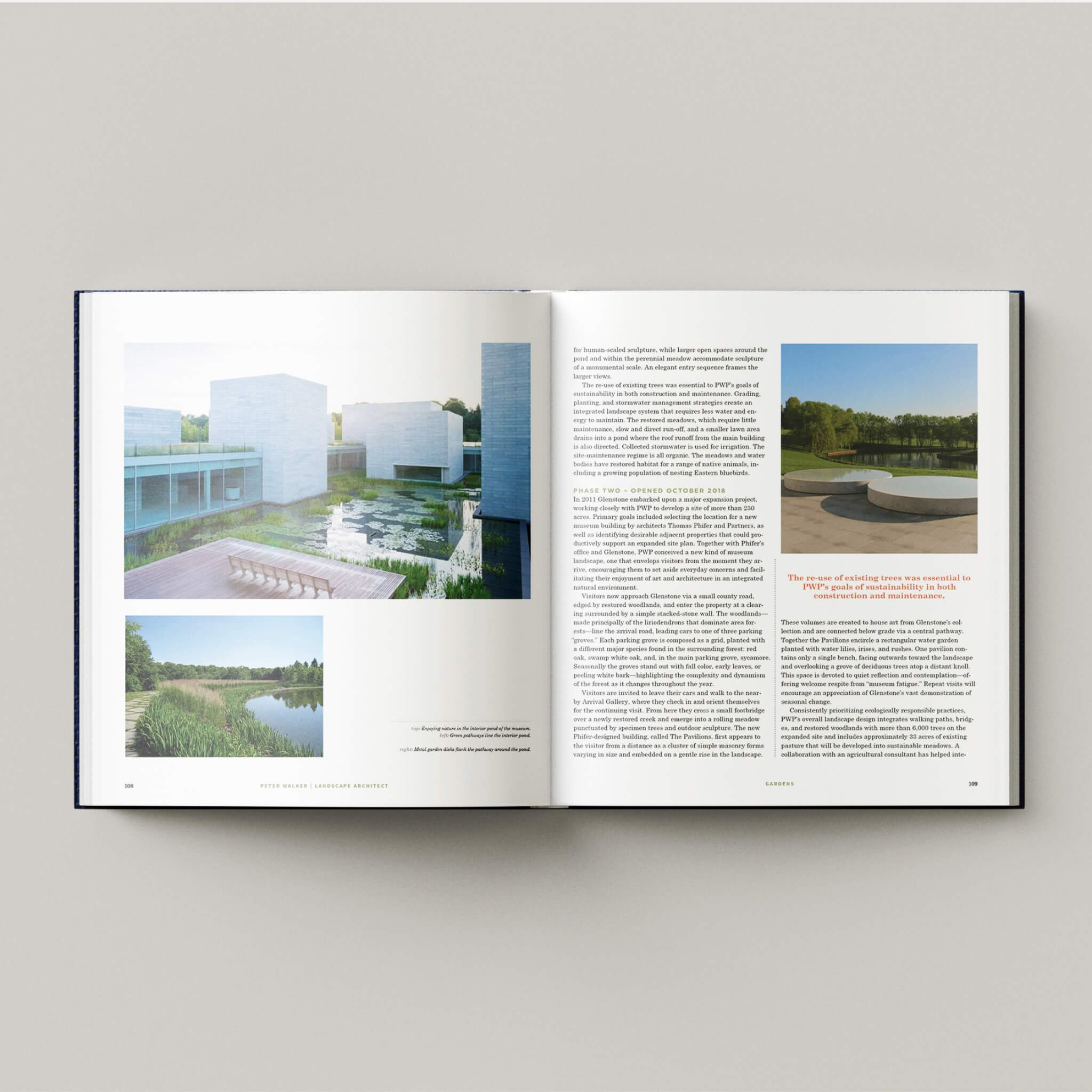
I started out with laying out my background grid in InDesign, selecting the line spacing and colunns desired for the best layout possible of my text and images. Because I wanted this to feel like a classic textbook, I selected Century Schoolbook for my body text. Gotham medium was my font choice for titles and other font selections found throughout include PP Radio Grotesk and Source Sans Pro. A color palette of greens was selected in keeping with a landscape color palette and a nice orangy red was also selected as a nice contrast.
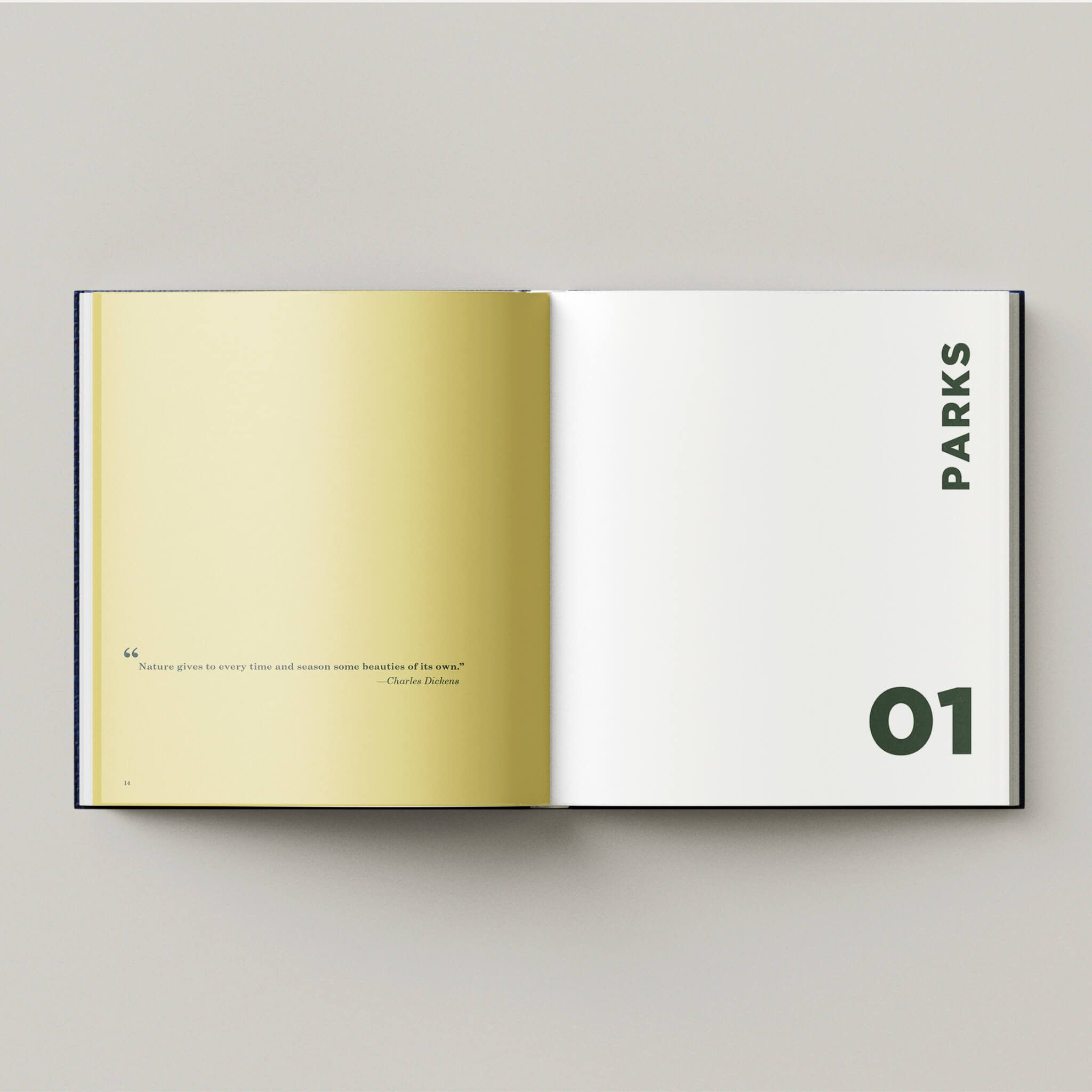
Section openers were all designed alike, with the same mustard color and quote on left hand side, number and section title on right hand side done in Gotham bold font. All chapter openers consisted of the name of the project being showcased in addition to its main image, a map of its location in the world, an opening quote and drop cap style on its first paragraph.
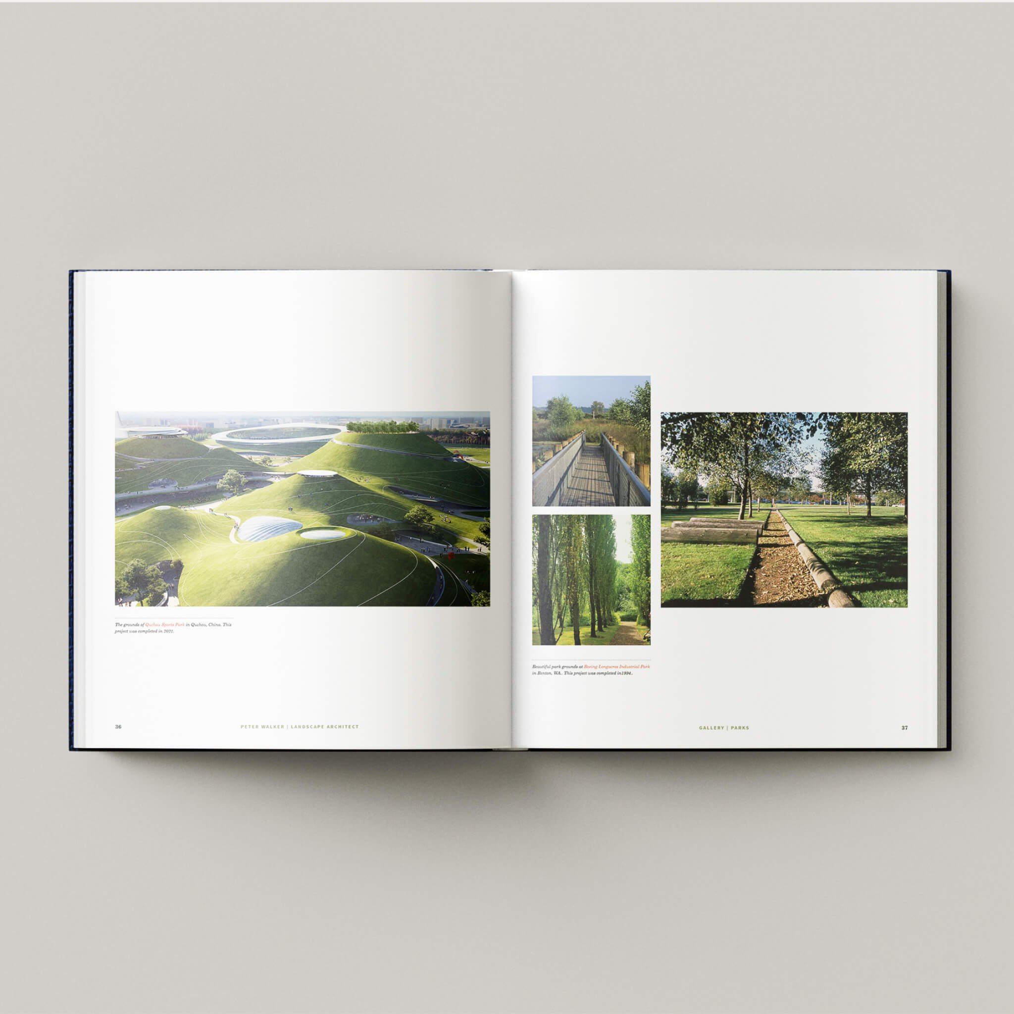
Image layouts throughout were done in classic grid styles, all in keeping with the structural layout of the columns for a cohesive and polished look.
None of the images are mine. They are borrowed from outside sources and were used for informational purposes only as a requirement for class.

